2026.9.10
Designing to Match the Words: Six Multilingual Projects That Don’t End with Translation
When the language changes, far more changes on screen than you’d expect. The length of a sentence. Where a line breaks.
The density of the type. How the white space reads. Words that fit on a single line in Japanese can spill onto two lines in English. In Chinese or Korean, even the visual center of gravity the characters create on screen shifts.
What’s needed, then, isn’t just placing the translated words — it’s looking again at the screen those words now sit on. Sometimes it means asking whether words are even the best way to communicate in the first place.
Picking up each small point of friction, one at a time, and thinking it through. We currently have 40 projects on record that fall under “multilingual support.”
This time, we’re picking out six of them, old and new. The language changes. The place changes. The audience changes. Each time, what did we change, and what did we keep the same, to deliver the work? We look at mount’s work through the lens of multilingual support.
Contents
Six Projects, Six Approaches
・AYANA BALI | Four languages, about 800 pages. Every line break, every bit of ongoing operation, held to the same standard.
・Shanghai World Financial Center | Turning the building’s own architectural thinking into the structure of the website.
・UNIQLO | NYC NOW | Going to the city itself, and building content out of that city’s “right now.”
・TOYOTA | Get Going Challenge | A site built so people everywhere could not just read it, but take part.
・KUBOTA FUTURE CUBE | Typesetting the English version letter by letter too, adjusting layout and even film to match the volume of text.
・Hoshinoya | Before translating, rethinking the value only that place can give.
What the six projects here have in common is that translation was never the finish line. We think about what we’re delivering, to whom, and how, and when it’s needed, we build the mechanism itself from scratch. It’s about paying attention all the way through, and seeing the work through to the end.
01 | Four Languages, About 800 Pages — Content Built With Hospitality in Mind
AYANA BALI
Multilingual Support That Cared as Much About the Translation Itself
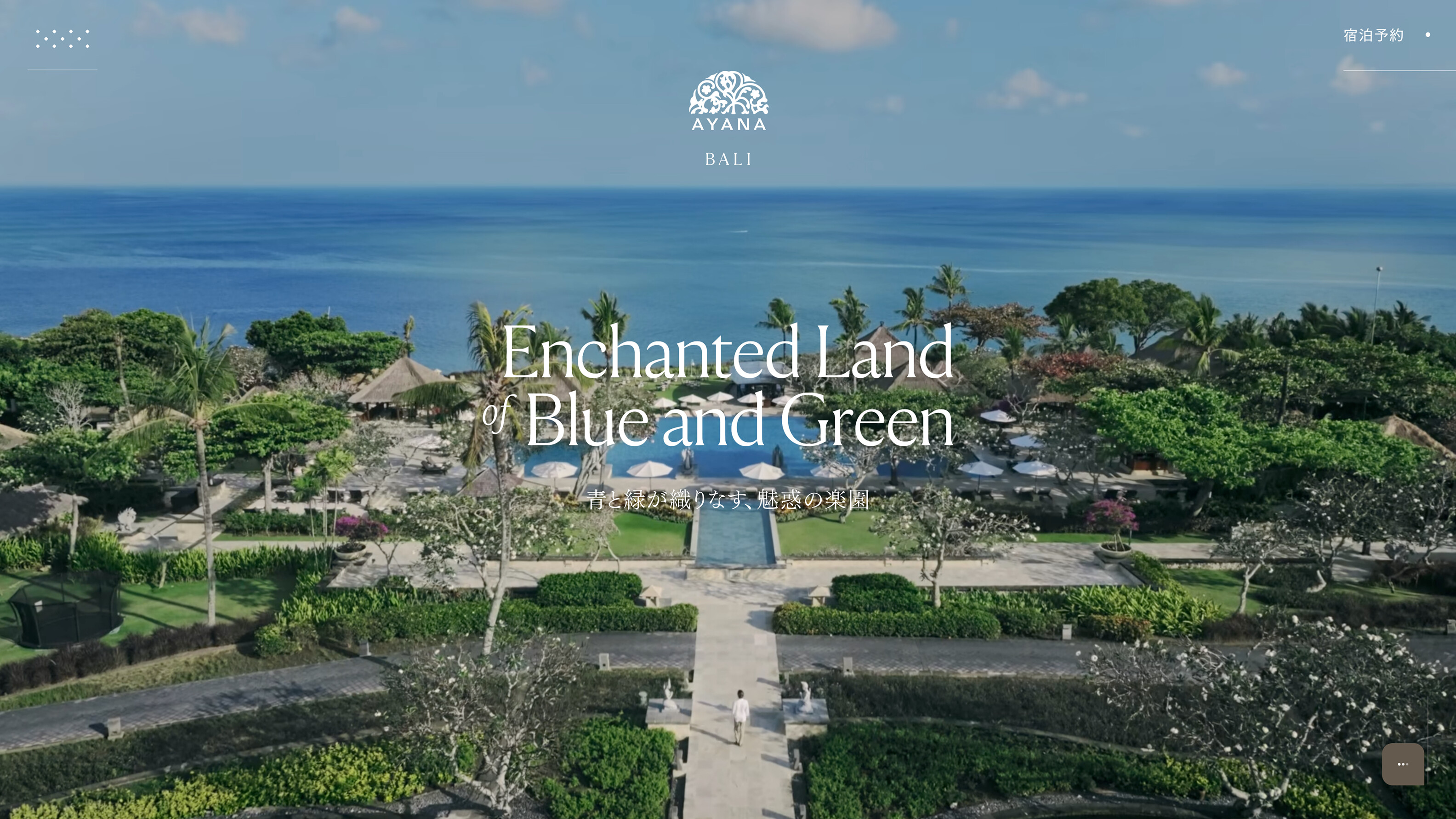
“AYANA BALI” is a large resort on the Indonesian island of Bali, drawing travelers from all over the world. Spread across 90 hectares, it’s a resort on a massive scale, holding four hotels, 30 restaurants and bars, 14 pools, and a huge number of facilities and experiences besides. For the website renewal, we spread that enormous amount of information across roughly 800 pages, and supported four languages — Japanese, English, Chinese, and Korean.

A Proprietary CMS Supporting Content Management Across Four Languages
We also built a proprietary CMS that generates pages from Google Sheets and Drive, so that four languages across more than 800 pages could keep being updated going forward. It made it possible to manage the text and images for all four languages inside a single sheet. On a multilingual site, polishing just one language isn’t enough. Rather than simple machine translation, it was built to efficiently handle from-scratch translation and text control across multiple languages. We use this same sheet for every language, not just Japanese, adjusting it by eye, again and again.
Bringing everything up to the same standard. From how it looks once the language changes, all the way through to running it afterward — on AYANA BALI, we saw it through, building up a huge amount of information piece by piece.

・You can also read more about AYANA BALI’s content production in this article.
[AYANA BALI] We’ve rounded up the content we obsessed over
02 | To Reach Audiences Abroad, Start by Rethinking How You Build the Experience
Shanghai World Financial Center


English Typesetting That Hasn’t Changed Since the Days of Flash
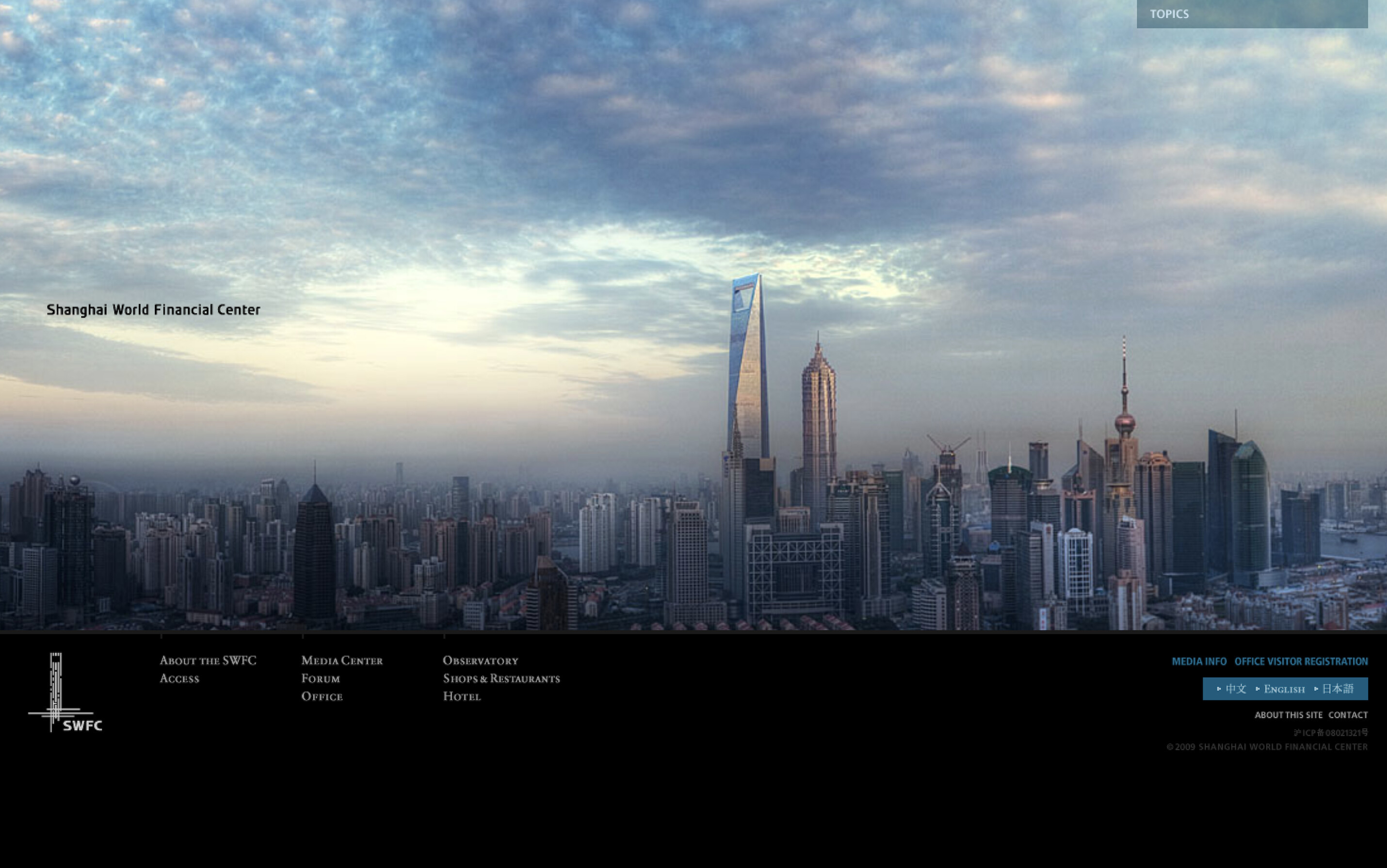
Completed in Shanghai in 2008 as Mori Building’s first overseas project, this is a 101-story, 492-meter supertall mixed-use tower. On the website, we stacked the photos and words that convey the building’s thinking, along with all of its facility information, vertically — building an interface that evokes the tower itself. This was to express, on the web, both SWFC’s concept of a “vertical garden (mixed-use) city” and the 101-story building itself.
Drawing inspiration from elevator interfaces, we also stacked Japanese, English, and Chinese vertically, letting navigation controls move visitors up and down.
Translating the architectural thinking itself into the structure of the website. By overlaying the act of moving down the screen with the feeling of ascending a 101-story building, it’s designed so that even someone who’s never been there can grasp the scale and philosophy of the place.
Even back when the site was built in Flash, before responsive design like today’s was the norm, we were already tailoring how type was set for each language. Our stance — treating multilingual support as something far broader than simply “preparing a page in another language” — hasn’t changed.
03 | Bringing New York’s “Right Now” Straight Onto the Web
UNIQLO|NYC NOW
“NYC NOW” is the brand site we built for the opening of the UNIQLO stores on Fifth Avenue and 34th Street in New York.
We sent a photographer to New York even before the opening, shooting UNIQLO’s advertising as it took over the city. We uploaded the footage we gathered, along with store and event information, day by day, continually updating that real-time information on a timeline set against a map of New York. After the opening, we pulled together all the footage we’d shot onto the map and produced a film showing UNIQLO’s very “now” in New York, renewing the website at the same time.
In the end, UNIQLO’s three stores were placed on a map of New York, and the site became a way of showing UNIQLO’s presence within the city itself.
* This website was originally built in Flash.


04 | Not Just to Read — Making It Something People Everywhere Could Join
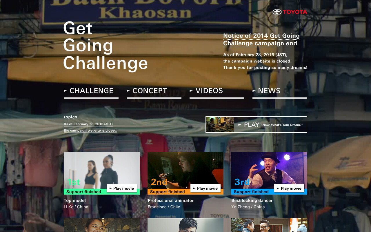
TOYOTA|Get Going Challenge
TOYOTA’s global campaign “Get Going Challenge” was a project that called on young people, through the site, to take on challenges in pursuit of their dreams, backing them with a total of one million US dollars in support.
Our work centered on building the English and Chinese versions of the site, along with an opening film to set the tone for the campaign, the interface for submissions and voting, motion graphics that visualized the text people wrote about their dreams, and the report content that shared the results.
What multilingual support needed to mean here wasn’t just “being readable.” Being able to submit your own dream. Being able to vote for someone else’s challenge. Being able to feel the campaign’s energy intuitively. We designed the experience all the way to the point where everyone, regardless of language or country, could take part in the same campaign. A multilingual site is a vessel for delivering information, but it can also become a mechanism that moves people across national borders. Once you factor in interaction and motion, there turns out to be a lot to design that sits outside of translation altogether.

05 | The English Version, Letter by Letter — Rebuilding the Screen to Match the Words
KUBOTA FUTURE CUBE
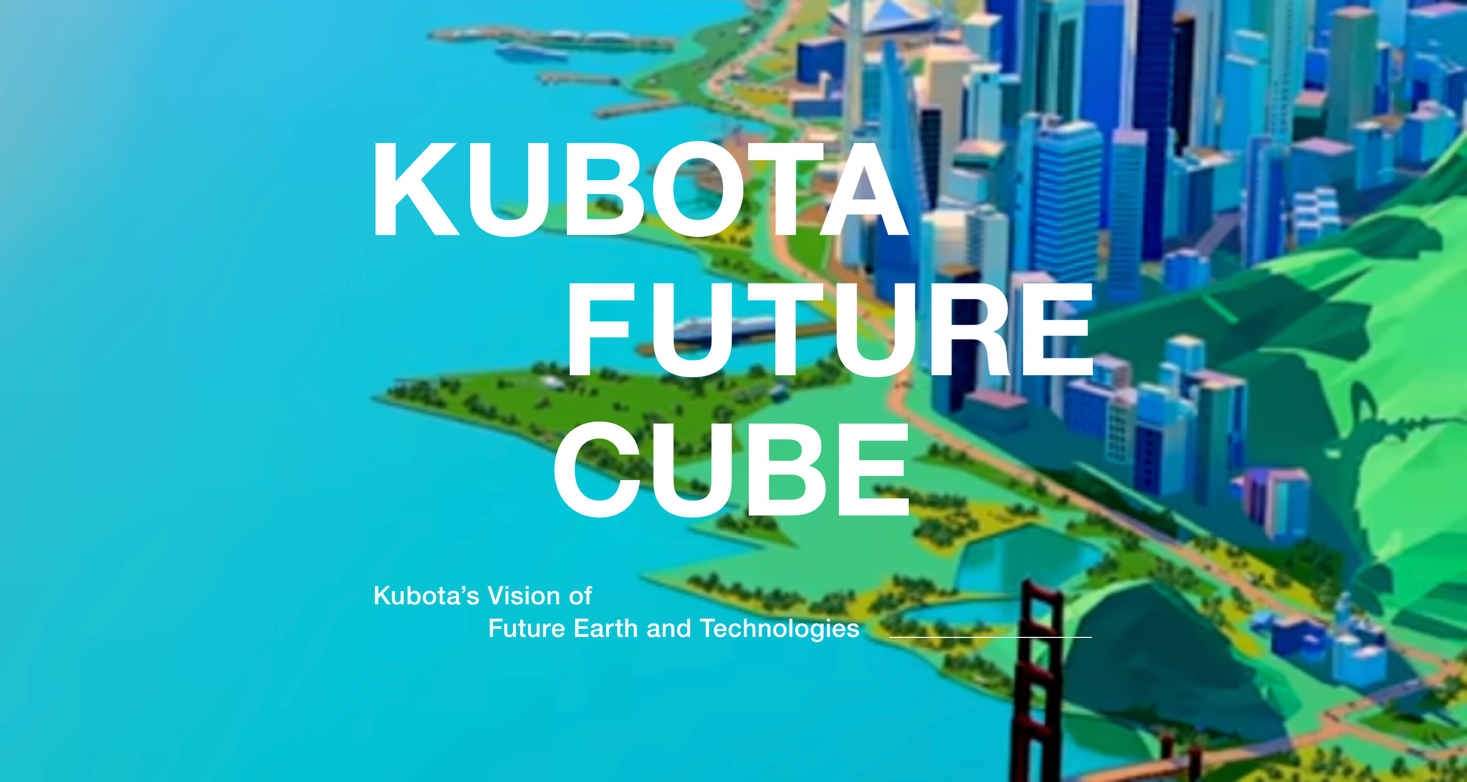
“KUBOTA FUTURE CUBE” runs in two languages: Japanese and English.
For the English version, rather than simply pouring the translated text into the existing layout, we adjusted the typesetting letter by letter, all the way through. We also went back over the layout and even the film’s cropping in detail, to match the volume of text that changed once it became English. Even with the same content, the length of a sentence, and the area the words take up on screen, both change between Japanese and English. Simply reusing the balance that worked for the Japanese version would have thrown off the relationship between text and film, and even the flow of the eye, that we’d intended.
So we checked the motion, the film, the animation, on both PC and smartphone, and finished the English version over again from there. We didn’t just translate — we designed to match the words. The multilingual support behind KUBOTA FUTURE CUBE is built up out of exactly that kind of fine-grained adjustment.


06 | Rebuilding an Experience Only That Place Can Give, Through Words and Photographs
Hoshinoya

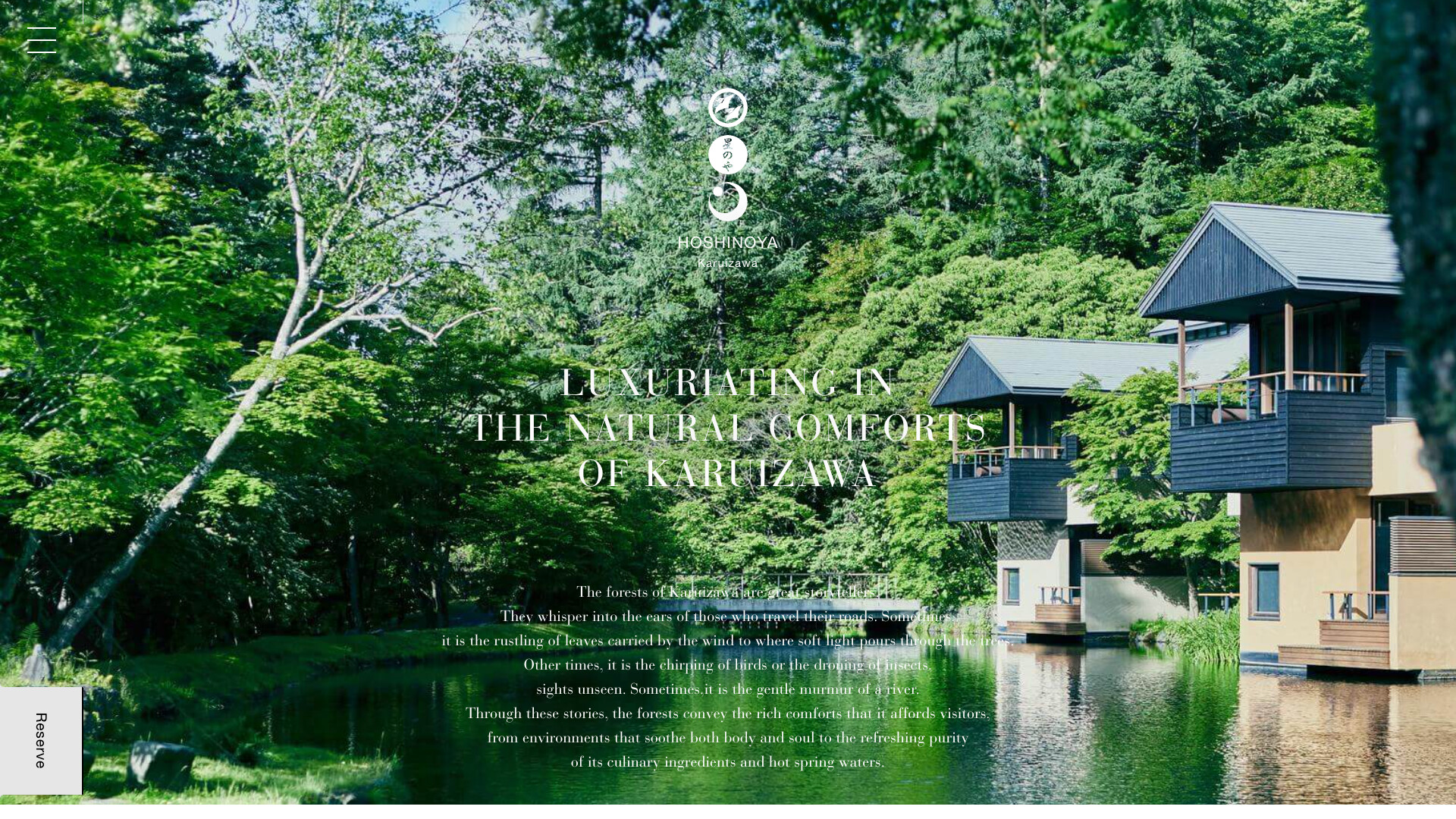
For the Hoshinoya website, we spent a total of 10 months rethinking the communications for all six properties.
We visited each site, held interviews and discussions, and revisited the existing concepts and facts from the ground up — starting from questions like “what is Hoshinoya, really,” and “what decisively sets it apart from other places to stay.” From there, we built everything through, from the content in photographs and words to the UI that leads into a booking, the design, and the implementation.
The site runs in Japanese and English, and the production credits carry a Balinese translation alongside the English. The appeal of a place to stay can’t be conveyed through facility specs alone. How do you turn the air of that place, the way you spend your time there, its culture, even the things you only feel once you’ve actually set foot in it, into words and photographs? Even when building pages for an audience abroad, we don’t just carry the Japanese information over as is — we start by rethinking the value itself that needs to be communicated. Before translation even begins, there’s work in sharpening exactly what it is you’re trying to say.


Seeing It Through, Down to the Last Language.
From Shanghai World Financial Center in 2008, to UNIQLO’s move into New York, TOYOTA’s global campaign, KUBOTA FUTURE CUBE, Hoshinoya, and now AYANA BALI.
The era is different. The industry is different. The web technology is different. And yet, when you line up these six projects, there’s something they share.
When the place you’re delivering to changes, you rethink what information is needed. When the language changes, you check everything down to the length and look of the text. Rather than applying a fixed method, you choose the method each job actually needs, based on what you’re delivering, to whom, and how. Sometimes that means adjusting a single character. Sometimes it means building a CMS to manage 800 pages. Sometimes it means building a map. Sometimes it means shooting footage, day after day.
Building a multilingual site isn’t just about preparing the same content in a different language. It’s building the same quality of experience all over again, for people who speak a different language, people in a different place. And when it’s needed, building the mechanism for that from scratch.
We’ve introduced six projects where we paid attention all the way through, kept our hands moving, and saw the work through to the end.
* This article used AI to help with the translation.